The Matte Department
Online matte painting class
Overview
The Matte Department plans to create and sell online classes that teach digital matte painting to students that want to work in the entertainment industry. A matte painter creates paintings of the backgrounds in live action and animated films and commercials. It’s a very specific skill that isn’t widely taught. The Matte Department wants to make this education easily available by teaching online.
MY ROLE
Solo UX/UI Designer. I did everything.
TOOLS
Figma, Miro, Photoshop, Illustrator
Problem
The client wanted to create a new website for a new online class from scratch. There was no branding, no existing product, and no users.
Goal
Design the branding, and create an e-commerce website that sells online classes and tutorials that teach matte painting.
Research
Research Goals
I started off with several interviews with the client to learn what his needs were, and how far along he was with the project. He had taught in person classes through another school, but he wanted to create his own school and teach online.
He put me in touch with several people, including former students that took his in person class, working matte painters, and other people in the VFX (visual effects) industry.
- Find out what people want to get out of taking an online class.
- Discover how people make decisions when choosing an online class.
- Research what pain points come up while taking the online class.
Feature Roadmap
I analyzed several popular online schools that teach matte painting, and looked at their strengths and weaknesses.
STRENGTHS
Clean layout. Instructor bio. Student work showcase. Alumni testimonials & videos.
WEAKNESSES
Can’t see detailed syllabus until you enter email
STRENGTHS
Clean layout. Instructor bio. Student work showcase. Detailed class syllabus. Blog. Student podcast.
WEAKNESSES
On course page, subnav bar isn’t sticky.
STRENGTHS
Clean layout. Instructor bio. Student work showcase. Class syllabus.
WEAKNESSES
Can’t take 1 class, have to register for whole program.
STRENGTHS
Instructor bio. Blog.
WEAKNESSES
Instructors don’t provide feedback. Can’t buy single tutorial, must pay for subscription. Dated layout and design.
FINDINGS
Top schools all had instructor bios, showed what companies former students were hired by, showcased student work. They all had a clean layout and good design. They utilized a lot of images.
User Interviews
I conducted interviews with 4 participants, all who have previously taken online classes. This is a summary of my findings:
MOTIVATIONS
Participants wanted to learn new skills to create portfolio pieces to eventually get a job as a matte painter, or stay current with trends if they were already working as a matte painter.
NEEDS
Participants wanted instructor feedback, and videos available for later, repeated viewings.
FRUSTRATIONS
Pain points included videos that had time restrictions, when video demonstrations happened too fast or were unclear, and when instructors had low energy
Define
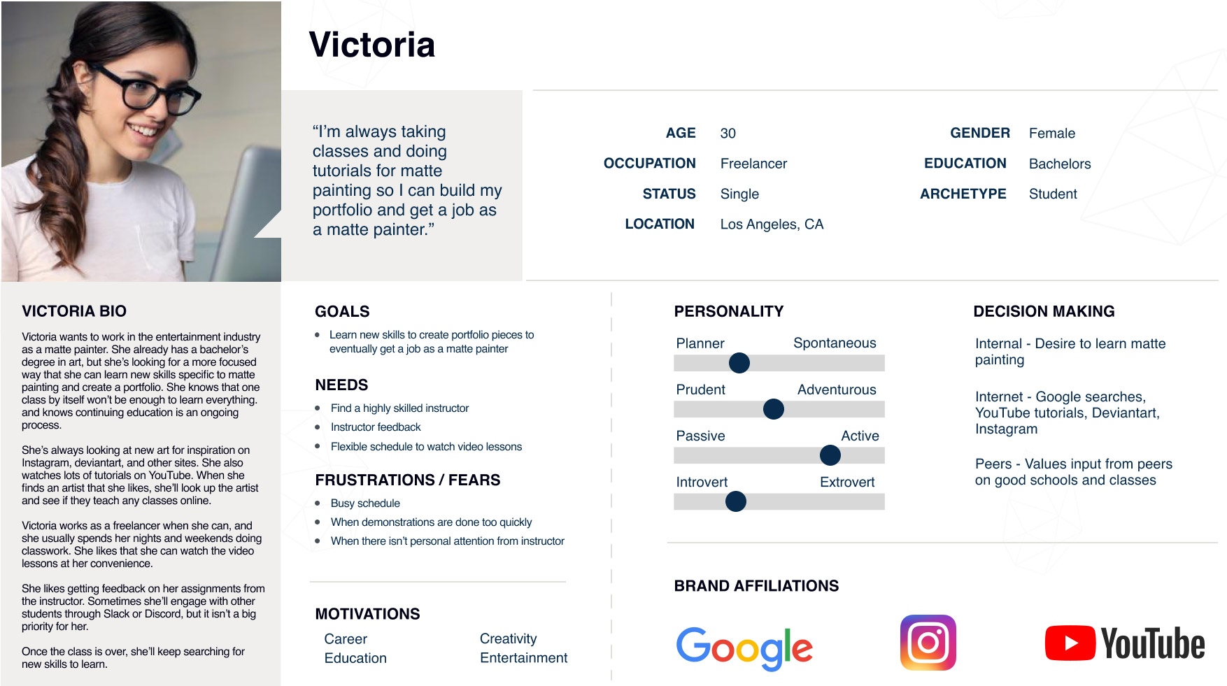
Persona
After conducting user interviews, I created this persona based on a typical student who already has related experience in the arts, but is trying to break in to the entertainment industry.
Her goal is to learn new skills and create portfolio pieces that will lead to getting a job as a matte painter.
Feature Roadmap
Based on user interviews, I broke down the various features people wanted when they were looking for an online class. Showing the varying importance of features lets the client know what to focus on in the initial version of the website, and what he can add later.
MUST HAVE
- Instructor artwork
- Instructor bio
- Video intro by instructor
- Streaming course video lessons
- Downloadable lesson files
- Class syllabus
- Responsive design
- Social media links
- Student dashboard
- Shopping cart
- Secure checkout
NICE TO HAVE
- Class prerequisites
- Benefits module
- Related tutorials
- FAQ
SURPRISING & DELIGHTFUL
- Free files for download: Photoshop brushes, etc.
- Free video lesson
- Ongoing contests and raffles
- Blog
LATER
- Student artwork
- Student reviews
- Video hero image
- Search
- Telegram/Slack group of students
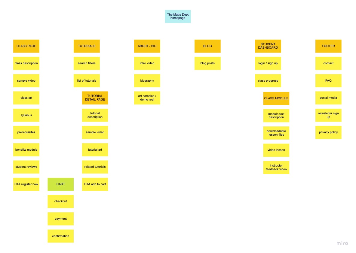
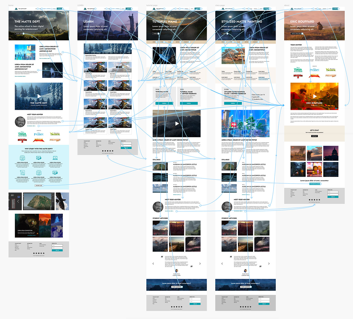
Site Map
The site map shows the information architecture and hierarchy of the site. The design allows for future expansion of content with additional tutorials and classes, and additional instructors. The student dashboard and actual course will be hosted on a third party platform.
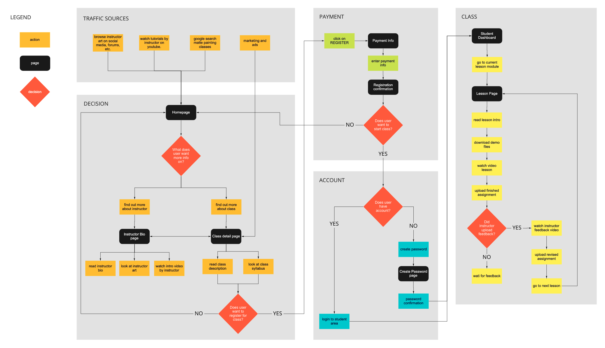
User Flow
This user flow shows the process as a user researches the online class, decides to register for the class, completes the payment process, and then starts the class modules.
Design
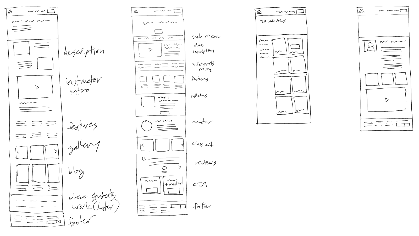
Initial Sketches
My initial drawings of the website layout were informed by the competitive analysis I did of popular online art schools.
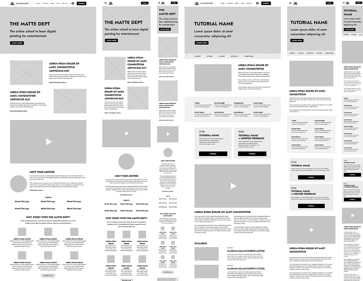
Low Fidelity Wireframes
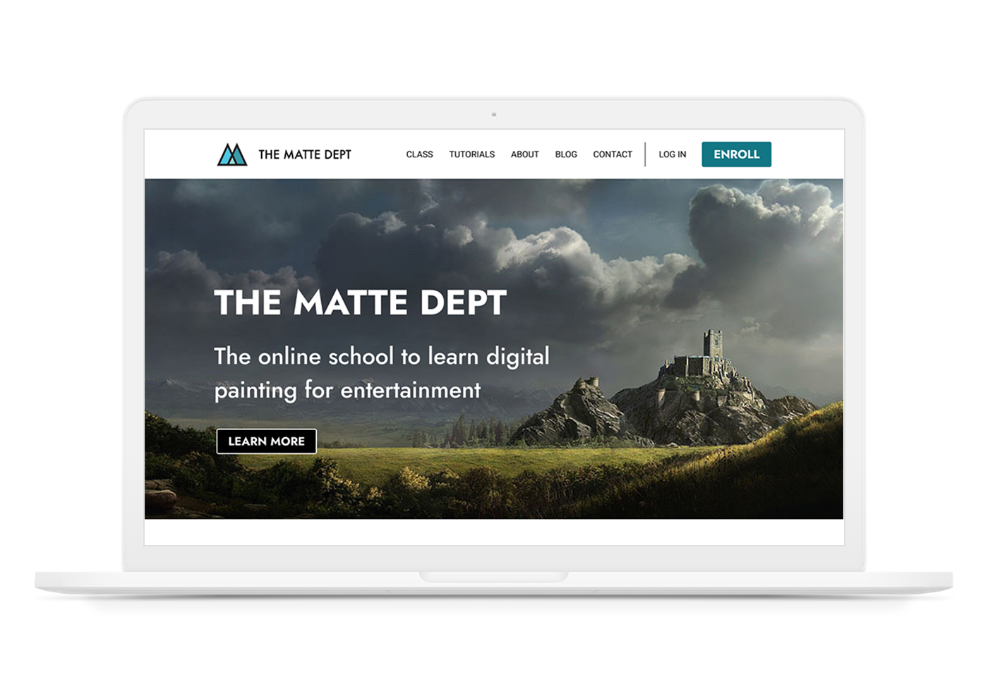
I created responsive wireframes for desktop, tablet, and mobile versions of the site. The main pages include the home page, the learn page which lists the classes and tutorials, the class detail page, and the about (bio) page.
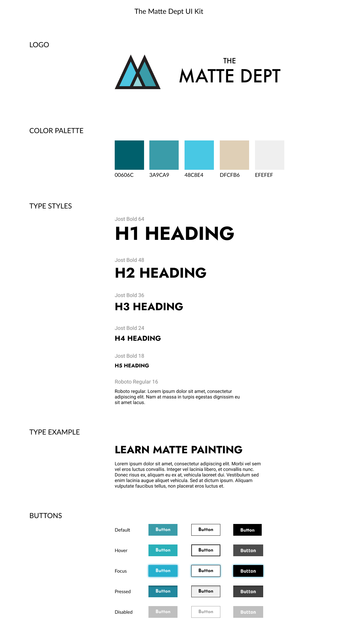
UI Design Kit
The Matte Department is a start up and didn’t have any existing branding. I designed the logo by using the silhouette of the letter M to convey mountains, since matte painting is focused on landscapes. I also wanted to convey the theme of layers in the colors, since matte painting consists of multiple layers of artwork to create the illusion of depth. The color palette is made up of green, blue, and beige to reflect nature and environments.
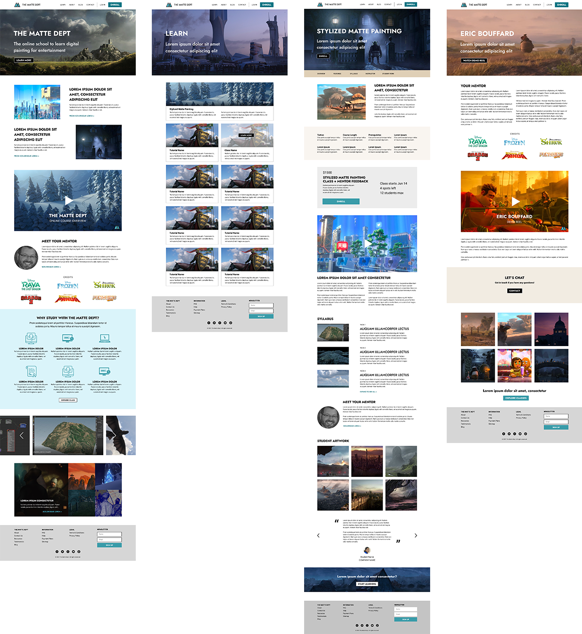
High Fidelity Wireframes
High fidelity wireframes were made for a desktop layout. This gave the client a chance to see what the site would look like, but also what images and copy he needed to finalize.
Build and Test
Prototype
I built a prototype for the desktop version of the site using Figma.
The goal of testing was to see if users could easily explore the site, research the details of the online class, register, and pay.
Usability Testing
OBJECTIVES
- Test if potential students could easily navigate the site, and find all the information they needed to decide on registering for the class.
- Find out if anything was missing, confusing, or frustrating during their experience.
- Gather opinions on the branding, including logo, color scheme, etc.
FINDINGS
- All video content was sought after and clicked on.
- The bio of the teacher plays a big factor on whether a student will sign up.
- The class detail page had all the necessary information that students were looking for, including syllabus, class schedule, etc.
- People liked the branding and design.
Affinity Map
I parsed the data from the participants and organized them by web page.

Next Steps
- Client needs to finalize all copy for website and approve final images.
- Client needs to create final product of video class and video tutorials.
- Client needs to choose video teaching platform. (Teachable or Thinkific).
- Client needs to find a designer or developer to build the website.
Recap
Working with a small business start up client was a lot of work, but very gratifying. The best part was when people who were interviewed asked when the actual class would be online, because they wanted to sign up. This gave the client a dose of confidence and extra validation to move forward. All the research suggests this online class has great potential for success.