Guestbook Insiders
Travel recommendations from local insiders
Overview
The Guestbook’s core business is a hotel booking website, but they wanted to expand and focus on experience enrichment for the consumer. Guestbook Insiders was a potential concept that would allow them to reach that new audience, but because it’s untested, they didn’t want to commit resources.
* I designed this product from the beginning with v1, but this case study mostly covers v3 of the website.
MY ROLE
Solo UX/UI Designer. I did everything.
TOOLS
Figma, FigJam, Photoshop, Illustrator, Usertesting.com
Problem
Guestbook Insiders is a new product that provides recommendations to travelers to help them get the best experience on their trip. The differentiating factor was our recommendations would be given by locals who live in the city.
In v2 of the product, user testing showed that only about 40% of the users preferred having an Insider giving recommendations, vs 60% for seeing the tips directly without having to select an Insider.
Because having Insiders was our differentiator in the market, I had to design the product so users understood the benefits of having Insiders.
Goal
Create a website that gives travelers recommendations by local insiders that live in Las Vegas, and present the content in a way where users preferred having Insiders give recommendations.
Research
Research Goals
Because we were creating a new product from scratch, there was no existing user base. We didn’t know who our customers would be, what they were looking for, what motivated them, or how they behaved. We were truly starting from zero, and only had assumptions to work off of.
I also studied competing companies that offered similar travel services.
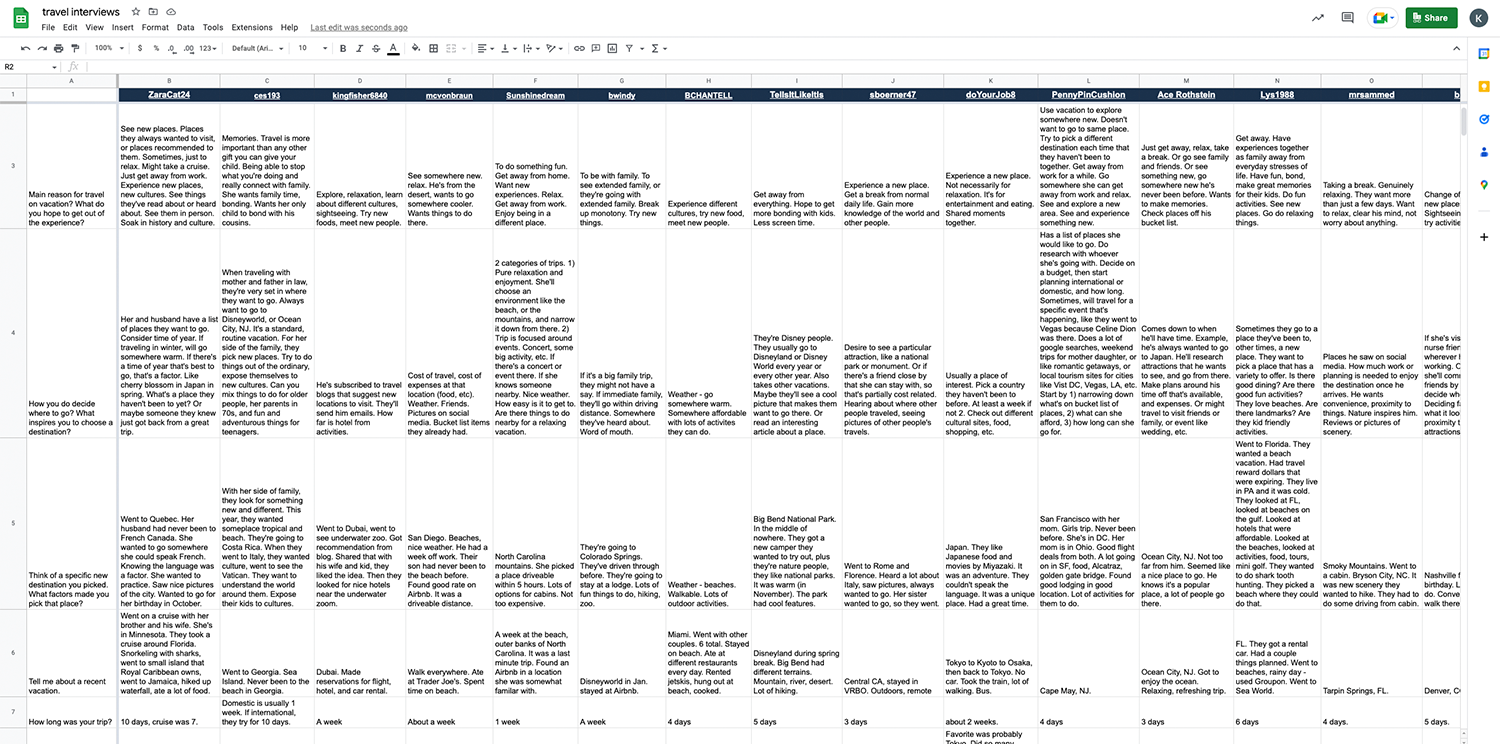
User Interviews
Because we were creating a new product from scratch, there was no existing user base. We didn’t know who our customers would be, what they were looking for, what motivated them, or how they behaved. We were truly starting from zero, and only had assumptions to work off of.
My initial goal was to get a broad sense of how and why people traveled.
I used usertesting.com to conduct multiple rounds of interviews, then compiled the results into a spreadsheet to quickly see how people answered specific questions.
GOALS
- Find out what motivates people to travel, and what they hope to get out of their experience.
- Find out how people research and make decisions for their trip
- Discover what tools people use to research a trip, and why they use those tools.
Competitive Analysis
Based on user interviews, I analyzed the most common tools people said they used when planning their trips.
Trip Advisor
STRENGTHS
- People trust the reviews
- Lots of content
WEAKNESSES
- Time consuming to find relevant information
Google > Travel Blogs
STRENGTHS
- Can find specific content that matches their search criteria
WEAKNESSES
- Content not always trustworthy
- Content may be dated
- Time consuming to find relevant information
Yelp
STRENGTHS
- People trust the reviews
WEAKNESSES
- Time consuming to find relevant information
- Quality of content can be hit or miss
Social Media
STRENGTHS
- Can communicate with people and get answers to your questions
WEAKNESSES
- Content not always trustworthy
- Quality of content can be hit or miss
Define
Persona
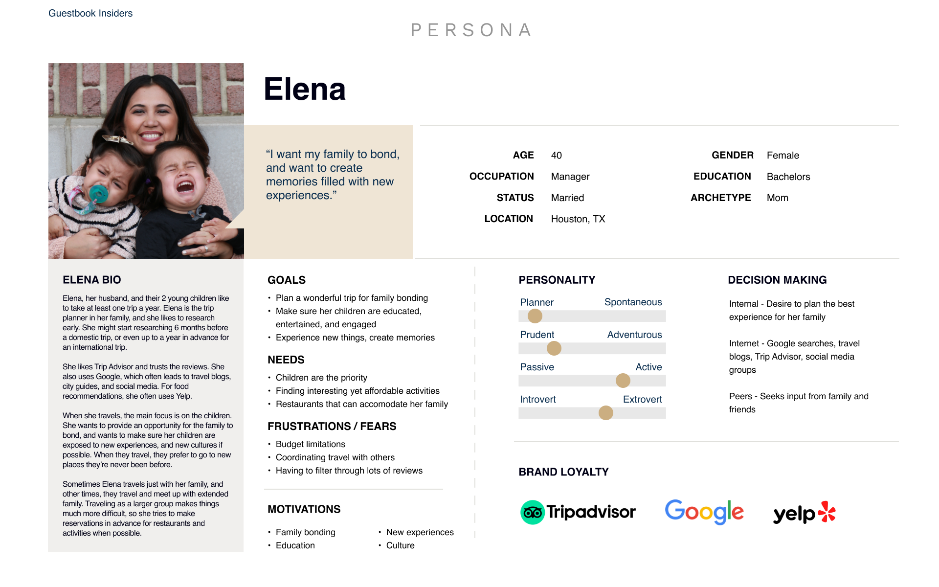
One of the personas that I created was the mother planning a family trip with her children. I created this composite from multiple mothers who were the primary trip planners in their family.
Feature Roadmap
We started v1 of the website with minimal functionality since it was just an MVP to serve as a proof of concept.
I interviewed users and asked them what features they would like to see, and what, if anything, they felt was missing from the product. We prioritized the most requested features into the next iteration (v2), where we also did an A/B test to test user flow, and repeated the entire process again for the current v3 build.
v1
- Trip Types
- Insiders
- Recommendations
v2
- Budget categories
- Filters for search results
- v2A User flow by trip type > budget > Insider > recommendations
- v2B User flow by trip type > budget > recommendations > insider
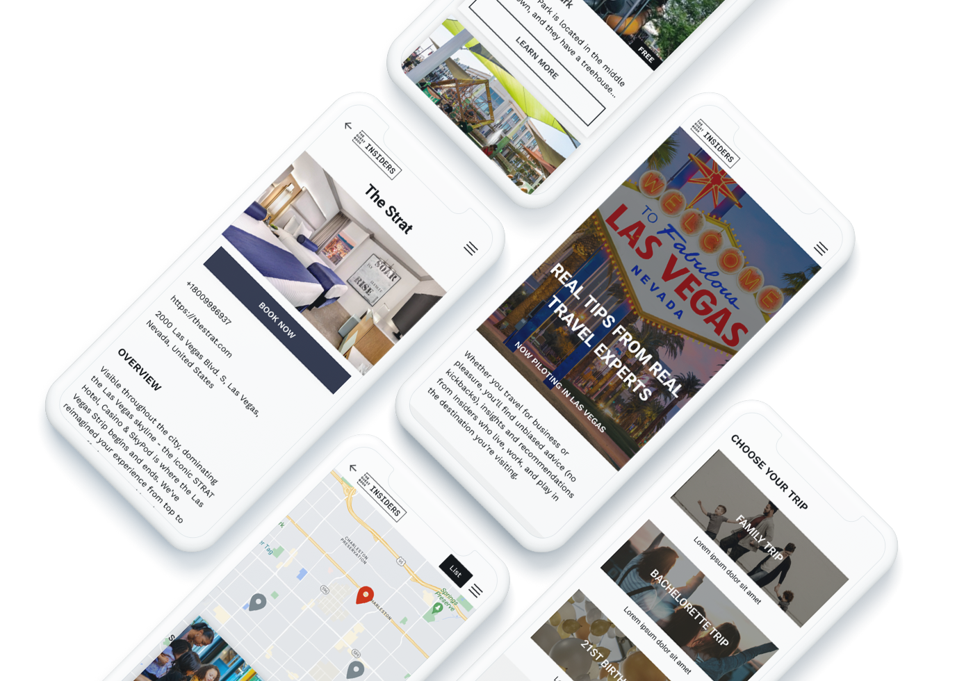
v3
- Hiring real Insiders
- Maps
- Hotel recommendations
- Full page bios of insiders
- Full page listings of recommendations
v3.1
- Save to favorites
- Video content
- User reviews of Insiders
- Book directly from website
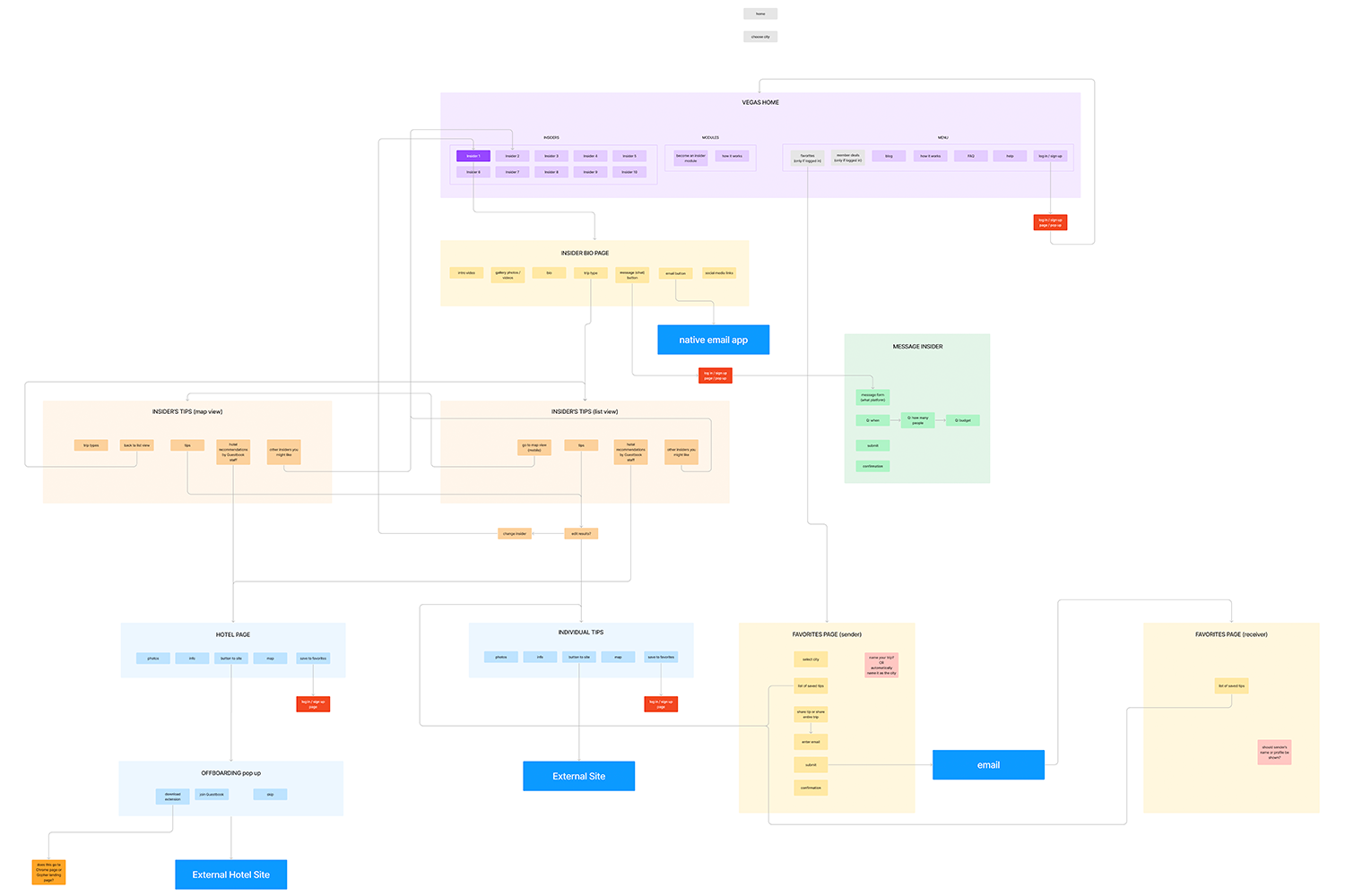
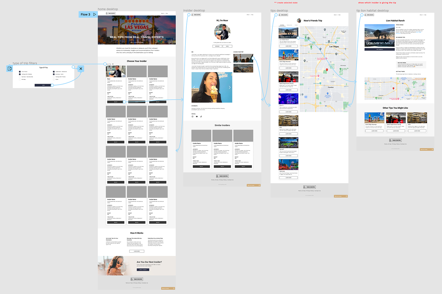
Site Map and User Flow
I like to combine the site map and user flow into one document.
The document shows all the points where we can track and measure the user’s behavior.
Design
Logo Exploration
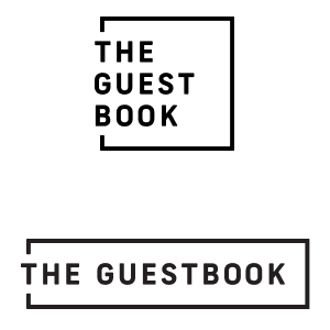
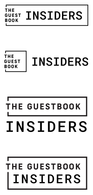
We started off creating Destination Insiders as a brand separate from the main Guestbook brand because we didn’t know if it would be successful or not. The initial v1 of the site was just an MVP to see if people would be interested in using a travel website where recommendations were made by locals. After initial positive feedback, the leadership decided to rebrand it as an extension of the core brand and call it Guestbook Insiders.
Other aspects of branding, like color palette and typography, were borrowed from the brand guidelines for the Guestbook, which was developed by an external agency before I started at the company.
EXISTING BRAND LOGOS
NEW LOGO EXPLORATION
Design Patterns
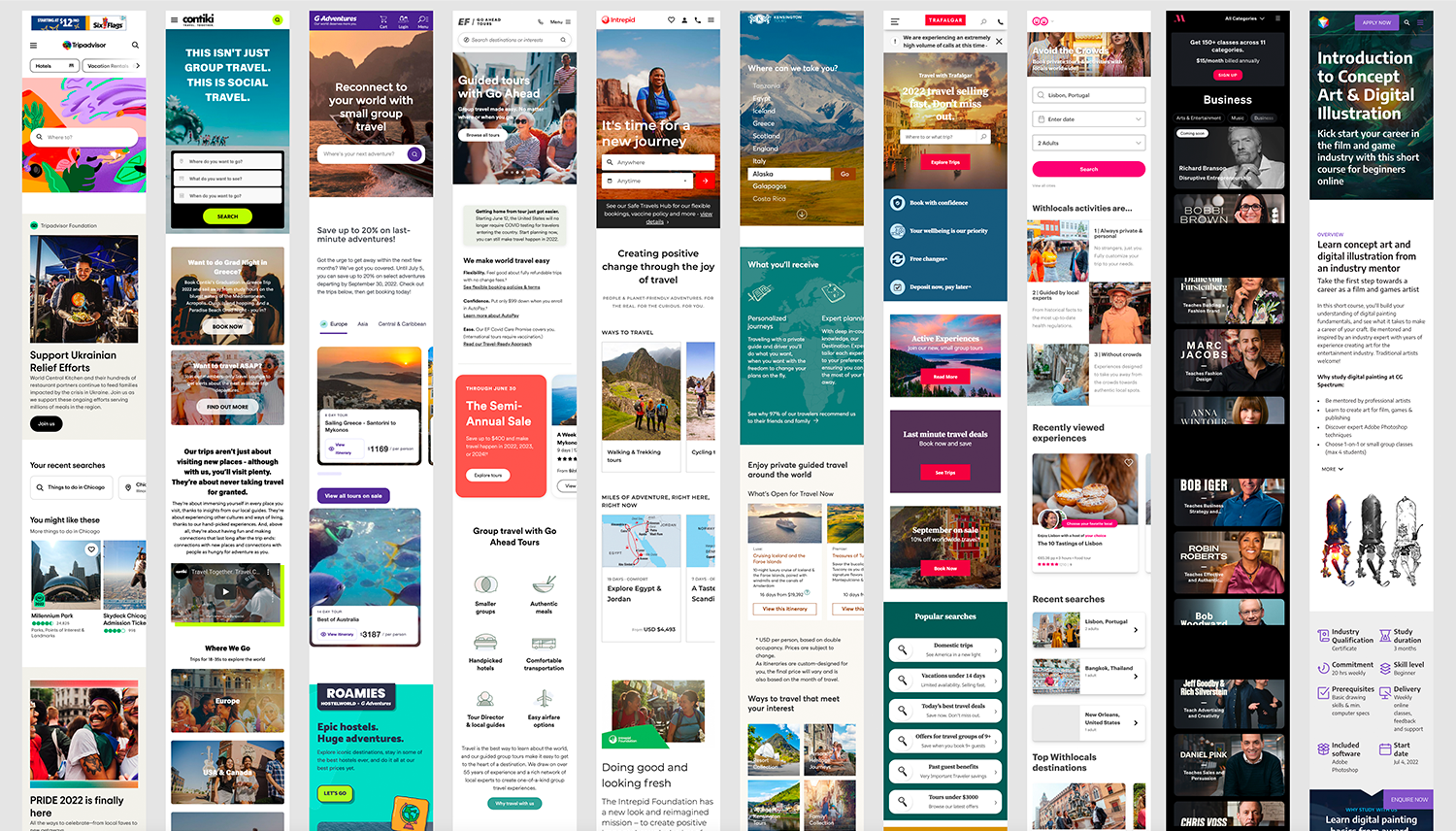
I analyzed various elements of several travel sites on desktop and mobile. I looked at how they treated cards, maps, bio pages, saving favorites, and more.
I also looked at websites outside of travel. I studied different onboarding flows including Pinterest, Twitter, and Stitch Fix.
Low Fidelity Wireframes
The stakeholders originally envisioned this product as a native mobile app, but because we were still exploring whether this concept was feasible, we started by designing a responsive website.
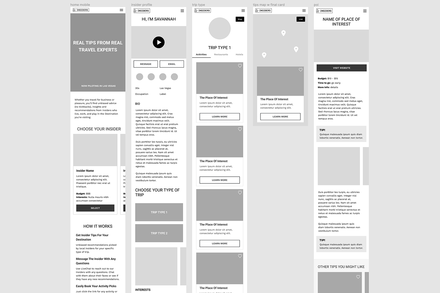
High Fidelity Wireframes
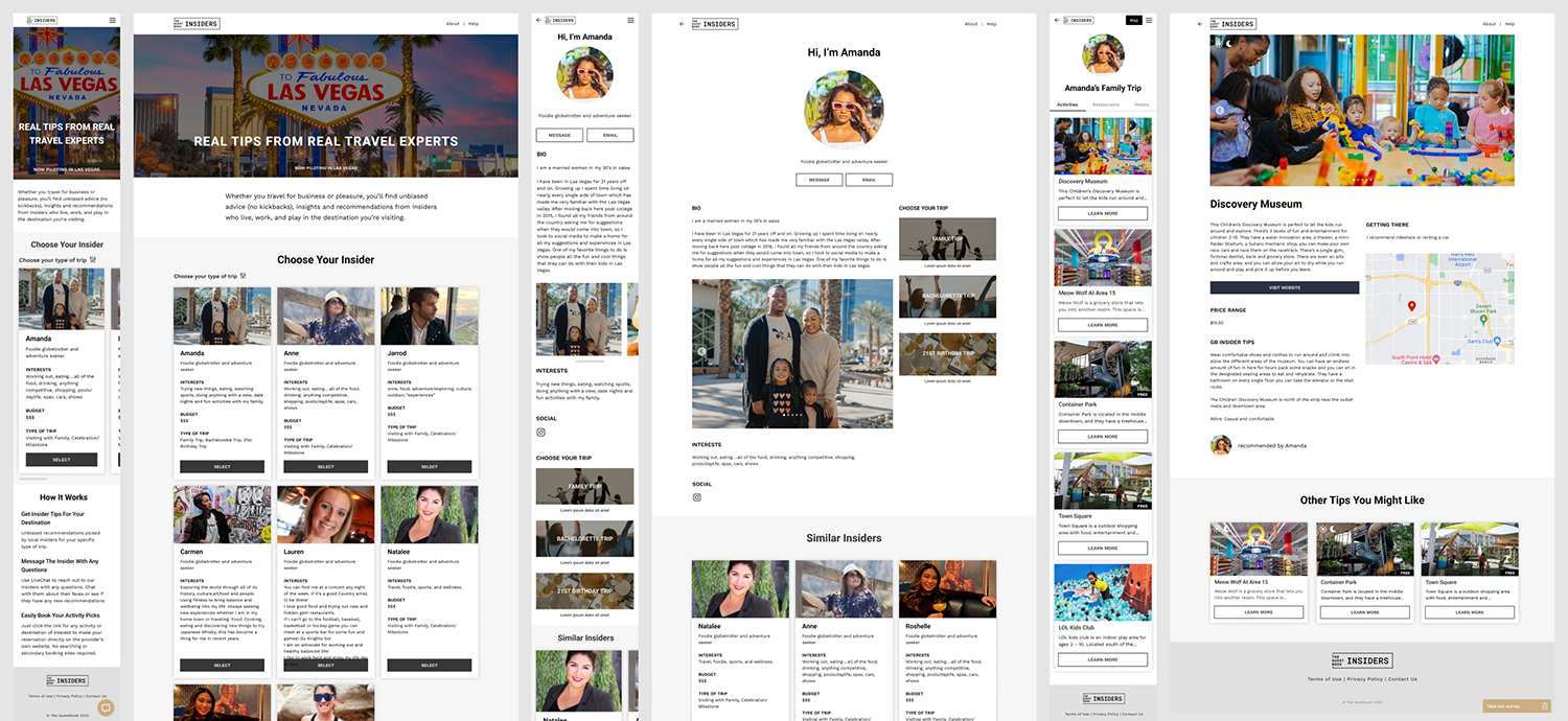
Once the basic layout was approved by the stakeholders, I made high fidelity wireframes using real content by newly hired Insiders.
Build and Test
Prototype
I created very simple prototypes for both desktop and mobile versions of the website.
Usability Testing
I tested the user flow from home page, to selecting an Insider, reading their bio, selecting a trip type, and choosing a recommendation. I tested separately for both desktop and mobile.
OBJECTIVES
- Determine if users like having to choose an Insider before getting recommendations.
- Make sure users can easily navigate the website and find the content they’re looking for.
- See if users like the quality and quantity of the recommendations.
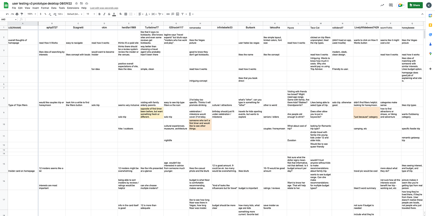
Findings
With this v3 design, the percentage of users preferring Insiders making recommendations vs not having Insiders and just seeing the recommendations jumped from 40% to 90%.
They thought the prototype of v3 of the website was well designed and easy to use. They were happy with the amount of recommendations, as well as the quality and length of useful information in each individual recommendation. People really appreciated the new map functionality, and liked that hotels were also recommended.
Recap
Within the span of one year, we will have designed, built, and tested 3 iterations of the Guestbook Insiders website. Building quickly allowed us to gather valuable user feedback, and we used that feedback to build the next iteration.
The positive feedback convinced the leadership of the company to commit more resources into this project, including hiring additional staff, and working with local insiders to provide content. The leadership even included Guestbook Insiders as a fundamental part of the future growth of the company, as it expands from a B2B hotel booking website into a B2C travel experience website.